How Celayix Increased Landing Page Conversions by 218% in 12 Months

Celayix had traffic. Celayix had ad spend. What Celayix did not have was a landing page that could turn either one into a booked demo.
Twelve months later their landing page conversion rate went from 1.4% to 4.45%. That is a 218% increase, on the same offer, in the same market, mostly with the same traffic.
Nobody rewrote the product. Nobody tripled the ad budget. We just stopped letting the website leak money.
Here is exactly how — every audit, every fix, every test, and the numbers behind each one. Steal whatever applies to you.

Who Celayix Is, and Why This Was Worth Fixing
Celayix builds employee scheduling and shift management software — time and attendance, an employee app, and full workforce management for operations teams in security, healthcare, hospitality and facilities.
Serious product. Real ROI story. Genuinely good marketing team behind it.
And that is exactly the problem I see in almost every B2B SaaS company I audit: the product is fine, the marketing is fine, and the page in between is quietly eating 60-70% of the pipeline.
Their team was doing the hard part — driving qualified traffic to a considered, multi-stakeholder purchase. Then that traffic hit a page that loaded in almost seven seconds on mobile, asked for eleven form fields before giving anything back, and buried the proof that would have closed the visitor three scrolls below where anyone actually scrolled.
Every one of those is a fixable problem. That is the entire point of CRO.
The starting line (month zero)
- Landing page conversion rate: 1.4%
- Form completion rate (started → submitted): 31%
- Mobile LCP: 6.8 seconds
- Mobile PageSpeed score: 38 / 100
- Conversion tracking: firing duplicate events, no reliable source attribution
- Structured A/B testing program: none
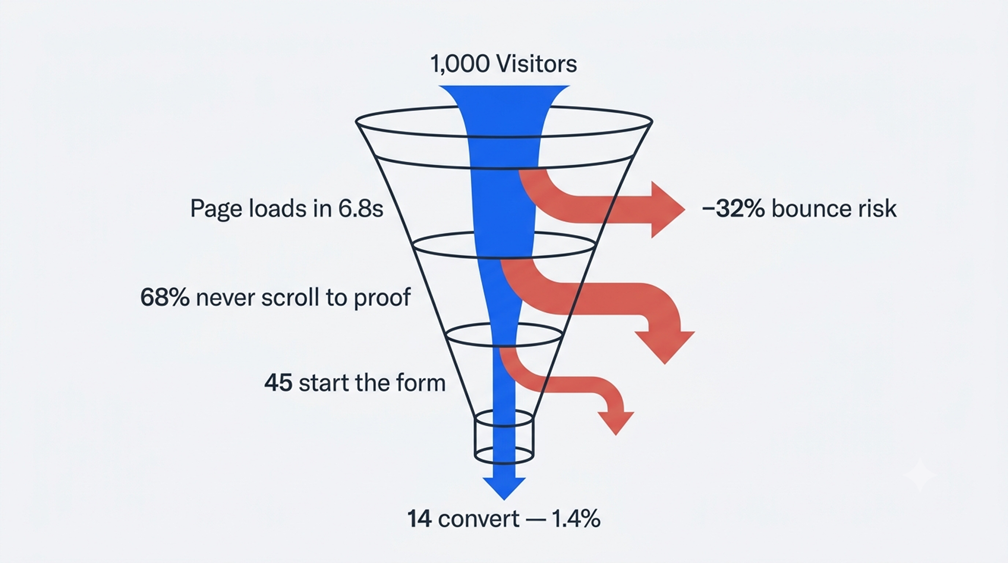
Read that list again. Out of every 100 visitors, 1.4 converted. Of the people who wanted to convert and actually started the form, 69 out of 100 gave up halfway. And because the tracking was broken, nobody could see it happening.
You cannot optimize what you cannot measure, and you cannot measure what you have not instrumented. Most "CRO problems" are actually measurement problems wearing a costume.
Phase 1 — Four Audits, Because Guessing Is Expensive
I do not touch a single pixel before I know what is broken. Redesigning without an audit is not optimization, it is gambling with someone else's revenue.
So we ran four separate audits over the first six weeks. Not one giant document nobody reads — four focused ones, each with a scored checklist and a prioritized fix list.
Audit 1 — Technical SEO & Performance
The one we ran first, because speed is not a "nice to have," it is a conversion multiplier. Findings were rough: 6.8s mobile LCP, render-blocking scripts, uncompressed hero assets, layout shift on load, and a mobile experience that visibly reflowed under the user's thumb.
Google's own data says bounce probability rises 32% when load time goes from 1s to 3s, and 123% when it hits 10s. Celayix was paying for clicks that never saw the page.
Audit 2 — Performance Re-Audit (post-fix verification)
This is the one most agencies skip. You do not get to claim a fix worked because you deployed it. You re-audit, you re-measure, you confirm — then you move on. We re-ran the full performance audit after the first round of fixes and caught three regressions that had crept back in through third-party scripts.
Audit 3 — Conversion & UX Audit
Here is where it gets uncomfortable, because it is all the small stuff nobody wants to hear about:
- CTA button colour was sitting inside the brand palette instead of standing against it — the primary action was competing with the navigation for attention
- CTA position put the main conversion action below the fold on the two most common mobile viewport sizes
- Form length — 11 fields, presented as one intimidating wall, before the visitor had received any value
- Visual hierarchy — heading sizes and paragraph spacing that made the page feel heavy and hard to scan
- Proof placement — testimonials and customer logos below the fold on a page where 68% of visitors never reached them
You would be surprised how much different spacing between paragraphs and titles costs you. Literally. A visitor can feel uncomfortable scrolling your page without ever being able to tell you why — and they don't tell you why, they just leave.
Audit 4 — Forms & Lead Capture Audit
The deepest one, and the one that produced the single biggest win of the engagement. We mapped every field, every validation rule, every error state, every drop-off point, and every event that fired (or double-fired) into HubSpot.
What we found: the form was the bottleneck of the entire business. 69% abandonment. And because the form only wrote to the CRM on final submit, every one of those abandoners was invisible. A person who typed their name and work email and then hesitated at "company size" was, as far as the CRM was concerned, never there.
Those are not bounces. Those are leads. They were being deleted by the form's own architecture.

Phase 2 — Speed: Fix the Floor Before You Build the House
A slow page invalidates every other optimization you run. If your test variant loads in 6 seconds, you are not testing your headline — you are testing your visitor's patience. And patience always loses.
I was the developer on this, not a consultant handing over a PDF. I rebuilt and shipped the pages directly in Unbounce.
What we did
- Rebuilt page templates mobile-first instead of desktop-down — over 60% of the traffic was mobile and it was being served as an afterthought
- Compressed and modernized every image asset, with correct dimensions and lazy-loading below the fold
- Deferred and consolidated render-blocking third-party scripts
- Eliminated cumulative layout shift by reserving space for dynamic elements
- Stripped dead weight — unused libraries, duplicate tracking snippets, legacy embeds
The numbers
- Mobile LCP: 6.8s → 1.9s (−72%)
- Mobile PageSpeed: 38 → 91
- Conversion rate: 1.4% → 1.6% (+14%) — from speed alone, before a single word of copy changed
+14% for making the page fast. No new creative. No new offer. That is pure margin that had been sitting on the floor.

Phase 3 — Tracking: The Unsexy Work That Makes Everything Else Possible
Nobody puts "we fixed the analytics" on a homepage. But if your tracking is wrong, every decision you make after it is wrong too — and you will feel confident the entire time you are wrong. That is the dangerous part.
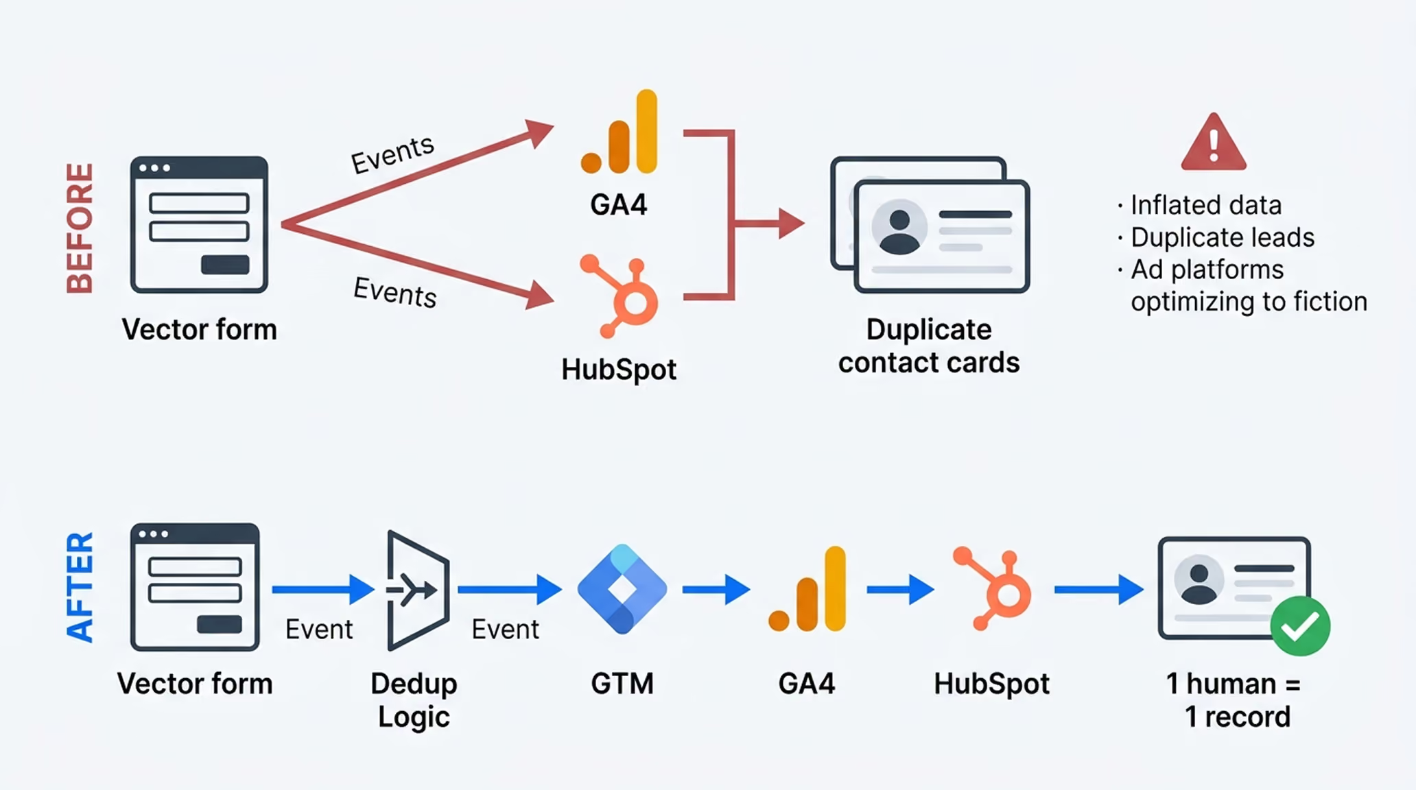
Celayix was running HubSpot, and conversion events were firing twice. Duplicate contacts. Inflated conversion counts. Ad platforms optimizing toward a number that did not exist. The marketing team was making budget calls on fiction.
What we rebuilt, from scratch
- Google Tag Manager container rebuilt from zero — clean naming, clean triggers, no legacy tags of unknown origin
- GA4 event architecture designed properly — one event per meaningful action, deduplicated, with consistent parameters
- HubSpot deduplication logic so a single human being creates a single contact, no matter how many times they interact with a form
- Single-fire event guards so a partial lead is recorded once and once only, then updated rather than duplicated when the person finishes
- Lifecycle stage mapping — partial submissions get their own stage so sales can see them without them polluting the MQL count
- CORS issues resolved by working directly with Celayix's developers — not filing a ticket and waiting, actually getting on the call and debugging it together
That last point matters more than it sounds. Most agencies stop at the boundary of their own access. We went past it, because a tracking problem that lives in the client's codebase is still a tracking problem that costs the client money.
Clean tracking is not a reporting nicety. It is the precondition for every A/B test you will ever run. Get it wrong and you will confidently ship losing variants for a year.
Phase 4 — The Multi-Step Form (The Single Biggest Win)
This is the one I would implement first if I only had one move.
The original form was eleven fields in one block. Psychologically, that is a wall. The visitor's brain prices the effort before they type anything, decides it's too much, and closes the tab.
What we built
Step 1 — the cheap ask. Name and work email only. Two fields. Almost no perceived cost. Commitment and consistency does the rest: once someone has started, finishing feels like completing something rather than starting something.
The moment they complete step 1, we capture the lead. Data goes to cookies, gets saved temporarily, and the conversion event fires — once — pushing a partial lead into HubSpot with its own lifecycle stage.
Step 2 and 3 — the qualifying detail. Company size, industry, shift volume, timeline. By this point they are invested, and every field has a visible reason to exist.
If they drop off: we still have them. Marketing can follow up. Sales can follow up. That person is a real, contactable human in the CRM instead of a bounce in a report.
If they come back: the cookie repopulates what they already gave us and asks them to finish the rest — then the existing record is updated, not duplicated.
Why this was technically hard
Because doing it badly creates a worse problem than the one you solved. Duplicate leads corrupt the CRM. Double-fired events corrupt the reporting. Both destroy the sales team's trust in the data, and once that trust is gone you do not get it back.
Getting this right meant event deduplication, cookie lifecycle rules, HubSpot record-matching logic, and a genuinely annoying week of tracing why one event insisted on firing twice. Worth every hour.
The numbers
- Form completion rate: 31% → 68% (+119%)
- ~24% of abandoners recovered as contactable partial leads that previously vanished
- Duplicate CRM records: eliminated
- Cumulative conversion rate at this stage: 2.25% (+61% vs. baseline)
One form change more than doubled the completion rate. If you are running an eleven-field form right now, that is your homework for this week.

Phase 5 — Watching Real Humans Instead of Arguing About Opinions
Once tracking was clean, we could finally do the part everyone skips: observe before you optimize.
We ran Microsoft Clarity across the landing pages and the homepage — heat maps, scroll maps, session recordings, rage clicks, dead clicks. Not to produce a pretty report. To settle arguments with evidence.
What the recordings actually showed
- Dead clicks on non-clickable elements — visitors were clicking feature icons and stat blocks expecting them to do something. Every one of those is a person telling you what they want, and getting silence back.
- Scroll drop-off before the proof — 68% of visitors never reached the testimonials. The most persuasive content on the page was being seen by a third of the audience.
- Rage clicks on a slow-responding element — the universal signal for "this is broken and I am now annoyed at your brand"
- Deep engagement with the comparison content — the sections explaining why Celayix over alternatives held attention far longer than anything else. That content was buried near the bottom.
What we changed because of it
- Reordered sections to match how people actually consumed the page, not how the sitemap was organized
- Promoted testimonials and success stories far higher, and made them specific — role, industry, and a number, instead of "great software!"
- Built new authority sections answering the question every B2B buyer silently asks: why you and not the other three vendors on my shortlist?
- Made dead-click elements actually clickable, or removed the affordance so they stopped teasing
- Rewrote spacing and hierarchy so the page scanned in seconds instead of requiring effort
The numbers
- Dead clicks: −82%
- Scroll depth to proof section: 32% → 74%
- Cumulative conversion rate: 3.05% (+118% vs. baseline)

Phase 6 — Message-Market Fit: Stop Sending Everyone to the Same Page
Celayix sells into very different worlds. A hospital scheduling nurses and a hotel scheduling housekeeping staff have almost nothing in common except that both of them hate spreadsheets.
Sending both to one generic "workforce management software" page means writing copy vague enough to insult both of them equally.
What we did
We ran keyword research with the marketing team — not in isolation, because they knew the buyer and I knew the funnel, and the answer needed both.
Then we built campaign-specific landing pages instead of broad ones. Hospitality. Hotels. Housekeeping. Each mapped to an actual ad campaign and an actual search intent, with:
- Headlines using the words that vertical actually types into Google
- Pain points written in that industry's language — no-shows and overtime for hospitality, compliance and coverage for healthcare
- Proof from customers in that vertical, not a generic logo wall
- Objection handling specific to that buyer's real hesitation
Search intent and page message finally matched. Ad relevance improved, which improved quality score, which lowered cost per click — before conversion rate even entered the equation.
And then we A/B tested every single one
Each vertical page got its own split test. Not one universal test declared the winner for everybody — different audiences want different things, and pretending otherwise is how you average your way into mediocrity.
- Hospitality page: +164% vs. the generic page it replaced
- Housekeeping page: +203%
- Hotels page: +141%
- Cumulative conversion rate: 3.87% (+176% vs. baseline)


Phase 7 — Modular Architecture: Win Once, Deploy Everywhere
Here is the operational trick that made the whole program compound instead of crawl.
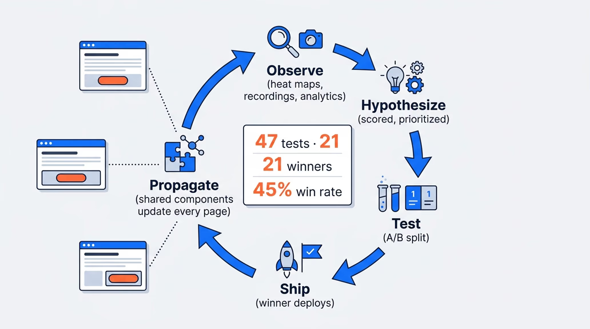
Many sections were shared across pages — social proof, comparison blocks, FAQ, the final CTA. So we built them as shared, synchronized components. Win a test on one page, and the winning version propagates to every page using that section automatically.
Why this matters more than it sounds
- Every test result got multiplied across the whole page set instead of living in one place
- No drift — pages could not slowly diverge into eleven slightly different versions of the same section
- Deployment speed collapsed — a change that used to take a day took minutes
- More tests per month, which is the only real lever on how fast a CRO program compounds
Most CRO programs die of friction, not bad ideas. If shipping a test costs you three days, you will run four tests a quarter and learn nothing. We ran 47 tests in twelve months, and 21 of them won — a 45% win rate against an industry average closer to 25%.
CRO is a cycle, not a project. The teams that win are not the ones with better hypotheses — they are the ones who can ship and measure faster than everyone else.
Phase 8 — Personalization: The Same Page, But Smarter
By this stage the fundamentals were solid. So we went after the compounding margins — the small things that only work once everything underneath them is already right.
Dynamic headlines and CTAs by UTM
If someone clicked an ad about overtime costs, the page they land on says overtime costs. Not "workforce management solutions."
We built dynamic H1s and dynamic CTAs driven by UTM parameters, so the message continuity between ad and page never breaks. That break — clicking a specific promise and landing on a generic page — is one of the most expensive and most common leaks in all of paid acquisition.
Result: +27% conversion rate on UTM-matched traffic.
Returning-visitor sections
B2B buyers do not convert on visit one. They research, they leave, they compare, they come back. So why show visit three the exact same page as visit one?
We built sections that stay hidden on the first visit and reveal on the second and third — deeper technical detail, implementation specifics, ROI breakdowns, stronger competitive positioning. The content a buyer needs when they have moved from curious to seriously evaluating. The CTA changed too: softer on visit one, more direct on visit three.
Result: +34% conversion rate among returning visitors.
Video engagement offers
The landing page had an explainer video, and video watchers are the highest-intent people on the entire page. They were being ignored.
We built timed offers that appear during the video — a free resource, a template, a guide — in exchange for an email. Then A/B tested the timing, the offer, and the copy. The email drops into the same partial-lead pipeline, so the marketing team can follow up with someone who has already demonstrated real interest.
Result: +19% total lead volume from the same traffic.
None of these three are dramatic on their own. That is the point. Accumulation is the whole game. Twenty small wins compound into a number that looks like luck to anyone who wasn't there for it.

The Full Results, Month by Month
Nothing here happened in one leap. It was a ladder, and every rung was earned and measured.
Months 1–2 — Foundation
Four audits. Speed rebuild. Tracking rebuilt from scratch.
Conversion rate: 1.4% → 1.6% (+14%)
Months 2–4 — The Form
Multi-step rebuild, partial lead capture, HubSpot deduplication.
Conversion rate: 1.6% → 2.25% (+61% cumulative)
Months 4–7 — Structure & Proof
Section reordering, promoted social proof, new authority sections, dead-click cleanup.
Conversion rate: 2.25% → 3.05% (+118% cumulative)
Months 7–10 — Message-Market Fit
Keyword research, vertical landing pages, per-page split testing.
Conversion rate: 3.05% → 3.87% (+176% cumulative)
Months 10–12 — Personalization & Compounding
Dynamic H1s and CTAs, returning-visitor sections, video offers, continuous testing.
Conversion rate: 3.87% → 4.45% (+218% cumulative)
Twelve-month totals
- Landing page conversion rate: +218% (1.4% → 4.45%)
- Form completion rate: +119% (31% → 68%)
- Cost per lead: −64%
- Mobile load time: −72% (6.8s → 1.9s)
- Mobile PageSpeed: 38 → 91
- Dead clicks: −82%
- A/B tests shipped: 47, with a 45% win rate
- Duplicate CRM records: eliminated
Look at the cost per lead line for a second, because that is the one your CFO cares about. Same traffic. Same spend. 64% cheaper leads. Every dollar of ad budget started doing roughly three times the work it was doing in month one — and it keeps doing that, every month, without paying for it again.

What Actually Made the Difference
Strip away the tactics and five principles did the heavy lifting. They apply to your business too.
1. Measure first, or you are just decorating
The tracking rebuild produced zero conversions by itself. It also made every subsequent win possible. If your analytics are lying to you, your optimization program is a very expensive coin flip.
2. Fix the floor before you build the roof
Speed, broken elements, dead clicks, layout shift. Nobody gets excited about this work. It delivered +14% before we changed a single word.
3. Reduce the cost of saying yes
The multi-step form did not add persuasion. It removed friction — and removing friction beats adding persuasion almost every time.
4. Match the message to the moment
Vertical pages, UTM-matched headlines, returning-visitor content. Same product, same offer. The only thing that changed was how well the page understood who was reading it.
5. Build for compounding, not for launch day
Shared components meant one win became many. 47 tests in twelve months only happens when shipping a test is cheap. CRO is a cycle. Run it once and you get a bump. Run it continuously and you get a moat.

What This Would Be Worth to You
Run your own math for a second, because this is not really a story about Celayix.
If your landing page converts at 1.5% and you drive 10,000 visitors a month, that is 150 leads. At a 20% close rate and a $12,000 average contract value, that is $360,000 in new business a month.
Now apply a 218% lift. Same traffic. Same spend. Same sales team.
That is 477 leads and $1.14 million a month — an extra $9.4 million over twelve months that was already sitting in traffic you had already paid for.
Even a fraction of that lift changes the shape of your year.
And here is the part most people miss: a conversion rate improvement never stops paying. Turn off your ads and the leads stop that day. Improve your conversion rate and every dollar you spend from that point forward — this quarter, next year — works harder. It is the only marketing investment that gets more valuable the longer you keep it.

Is This a Fit for You?
Straight answer, because I would rather lose the deal than waste both our time.
This works if you
- Have real traffic already — paid, organic, or both — and suspect it is underperforming
- Sell something with enough contract value that a percentage point of conversion rate is meaningful money
- Are willing to test instead of defending decisions that were made in a meeting two years ago
- Want a system you keep, not a redesign you pay for once and watch decay
This does not work if you
- Want a redesign, a "refresh," or something that just looks nicer
- Need a guaranteed number by next Friday — the first month is audits and instrumentation, and skipping that is how programs fail
- Are not prepared to change anything the data disagrees with
- Think CRO is a one-time project. It is a cycle. If you are not committed to running it, we are not a good fit — and I will tell you that on the first call rather than after you have signed.
Want to Know What Your Page Is Leaking?
Every engagement starts the same way it started with Celayix: an audit. Technical, conversion, UX, and forms. Scored, prioritized, and honest about what is actually costing you money — including the parts you will not enjoy hearing.
No redesign pitch. No retainer conversation until we both know the numbers are worth it.
Book a conversion audit and let's find out what your traffic was supposed to be worth.
Frequently Asked Questions
Everything you need to know before getting started.
Most CRO agencies stop at recommendations.
We handle:
• strategy
• implementation
• testing
• optimization
No handoffs between teams.
No waiting on developers.
No “lost in translation” between strategy and execution.
You work directly with the person building the system — from analysis to deployment.
Some improvements happen quickly.
Fixing UX friction, messaging clarity, page structure, or speed issues can improve conversions within the first few weeks.
For larger gains through A/B testing and optimization cycles, timelines depend on your traffic volume and data collection speed.
The goal isn’t random tweaks.
It’s building a system that improves continuously.
That’s completely fine.
Most clients work with us because they don’t want strategy stuck waiting on developers.
We handle:
• implementation
• tracking
• testing
• optimization
No handoffs.
No project management chaos.
No execution bottlenecks.
We primarily work with:
• SaaS companies
• B2B services
• High-ticket offers
• Professional service businesses
The best fit is a business where improving conversion rates directly impacts revenue.
We are less focused on low-ticket eCommerce or high-volume consumer brands.
The program is built to improve the full conversion system, not just redesign pages.
You can access the pricing page to see what’s included
By the end of the program, you’ll have:
• validated insights
• improved conversion infrastructure
• tested winning variations
• a clearer optimization roadmap
From there, most clients either:
• continue optimization monthly
• expand testing into new funnels/pages
• or take the system internally with full documentation
The goal is long-term performance — not a temporary redesign.
Still have questions?
Let's talk. Book a quick call and we'll figure out if this is a good fit.
Limited Client Intake
we are only onboarding a small number of businesses while refining our CRO system.If you want direct implementation, testing, and optimization support — now is the best time to start.
